


When it comes to running a Micro-SaaS business, the landing page is your most powerful marketing tool. It’s more than just a digital brochure; it’s your primary salesperson, one that has to be fast and available 24/7. A great Micro-SaaS landing page doesn’t just tell people what your product does; it shows them, excites them, and most importantly, convinces them to take the next step.
In this blog post, we go beyond the basics. Read on to see how you can design a Micro-SaaS landing page that not only attracts but also converts.
The Micro-SaaS Advantage: Why One Page?
Micro-SaaS products are typically niche-focused software solutions that solve specific problems for small, targeted audiences. These businesses often lack the resources for complex marketing funnels, so the landing page becomes their primary focus. A single-page design is not just a trend; it’s a necessity. It’s fast, it’s efficient, and it’s hyper-focused.
But what makes a great one-page design? Explained next are key elements that convert a visitor into a customer.
The Anatomy of a High-Converting Micro-SaaS Landing Page
A well-structured landing page does the heavy lifting of your marketing. At its core are the value proposition and interactive elements.
Value Proposition: The Headline That Stops the Scroll
Your value proposition should be the first thing a visitor sees, and it needs to explain the problem your product solves compellingly and clearly. If a visitor doesn’t understand your product within the first few seconds, they’ll bounce. Keep it concise, clear, and focused on the problem.
Example
If your product helps teams streamline communication, your headline could be:
“Communicate Smarter, Not Harder: Your Go-to Team Messaging Tool for Seamless Collaboration.”
Interactive Element: Quick Value Test
Create an interactive component that instantly lays out your value proposition. Here’s a mini calculator or interactive form that visitors can use to visualize the benefits of your product.
| Enter your team’s size | Estimated Time Saved |
|---|---|
| 1-5 employees | 3 hours per week |
| 6-20 employees | 10 hours per week |
| 20+ employees | 25 hours per week |
This simple interaction gives visitors immediate value and shows them exactly how your product can save them time.
Product Demo: Show, Don’t Tell
A picture is worth a thousand words, but an interactive demo can convert a visitor faster than any image. People want to see your product in action, so a simple screenshot won’t do.
Interactive Demo: Try Before You Buy
Integrating an interactive product demo directly on your landing page allows potential customers to play around with your product and see how it works. You can embed a live preview, a demo video with clickable elements, or a guided tour of your product.
Example
If your Micro-SaaS product is a project management tool, provide an embedded demo where users can interact with your interface and experience how easy it is to manage tasks.

Trust: The Social Proof Power Play
Building trust is essential to converting visitors. No one wants to risk their time or money on a product they don’t believe works.
Customer Testimonials & Reviews with Dynamic Scrolling
Instead of static reviews, use a dynamic testimonial slider that continuously shows fresh reviews from different users, with accompanying photos, job titles, and short endorsements on how your product helped them.
Example
A testimonial slider could feature:
- “This tool completely changed the way our team communicates. Highly recommended!” – Sarah L., Marketing Lead
- “We saved over 20 hours a month using this product.” – John D., Operations Manager
Customer Stats Table: Transparency Drives Trust
An engaging customer stats table that shows your product’s real-world impact can go a long way in boosting credibility. Here’s an interactive chart that outlines how your SaaS product has improved performance for users.
| Metric | Before Using [Product Name] | After Using [Product Name] |
|---|---|---|
| Time spent on task | 10 hours per week | 2 hours per week |
| Customer Satisfaction | 75 % | 92 % |
| Team Efficiency Increase | 15 % | 35 % |
You can make this table interactive so users can hover over each row to see the before and after scenario in more detail.
Design: Keep It Simple, But Engaging
The design of your landing page should be visually appealing but not overwhelming. Focus on simplicity, fast load times, and mobile responsiveness.
Design inspiration is key to creating engaging landing pages. Our guide puts forward five proven strategies for finding focused design inspiration.
Micro-SaaS Color Palette and Branding
Use colors that reflect the brand and invoke the right emotions. If your SaaS is built for productivity, consider calm blues and greens. If it’s a tool for marketing, use vibrant colors like oranges and yellows. Keep the palette minimal to avoid distractions.
CTA: Converting Visitors into Users
Your call to action (CTA) should be hard to miss and clearly guide the user to the next step. Make sure your CTA stands out with contrasting colors and to-the-point action words.
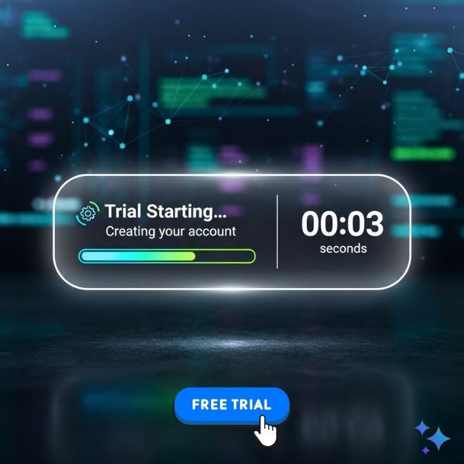
Interactive CTA Button: Real-Time Feedback
Rather than just having a “Sign Up” button, create a button that shows real-time benefits when clicked, like a progress bar or countdown. For instance, when a visitor clicks the “Start Free Trial” button, it could change to say “Trial Starting… Creating your account” with a visual bar showing how long the process will take.
Pricing: Simple, Clear, and Transparent
Make sure your pricing structure is simple and easy to understand. If you’re offering a free trial, make that clear. Don’t overcomplicate things with hidden fees or unclear terms.
Interactive Pricing Table
An interactive pricing table that dynamically updates depending on the visitor’s needs can be incredibly useful. Here’s a simple model:
| Plan | Features | Price |
|---|---|---|
| Basic | 1 user, 5 projects, email support | $15/month |
| Pro | 5 users, 50 projects, priority support | $45/month |
| Enterprise | 20+ users, unlimited projects, 24/7 support | $100/month |
Visitors can hover over different plans to highlight which features are included at each price point. This makes the decision-making process smoother and faster.
Perfecting Your Micro-SaaS Landing Page
A Micro-SaaS landing page should do far more than just tell visitors about your product; it needs to engage, show value, and convert them.
A/B test everything, from headlines to CTA buttons, to ensure you’re continually improving and optimizing for maximum conversions. Remember, Micro-SaaS landing page is your first impression. So make it count.
If you want help designing your landing page, we’re here. Digillex specializes in creating high-converting, great-looking landing pages. Let’s make your product shine.