


Creating an interactive testimonial slider in Divi is an excellent way to display client feedback in an engaging way. This slider is a modern, interactive design that presents testimonials in a kind of cool way.

Users can scroll through each testimonial horizontally, with a smooth, touch-friendly interaction. Each slide expands on hover to show more content, making it easy for visitors to focus on individual testimonials.
This simple yet elegant effect positively impacts the user experience by maintaining a clean, organized layout without overwhelming the viewer.
Following are the steps on how you can quickly set up this functionality using simple code in Divi’s Code module.
Steps to create an interactive testimonial slider
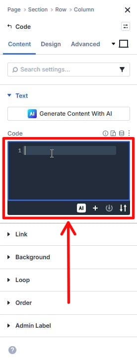
1. Build the Divi container
Add a Section → Row → Column → insert a Code module.

2. Add the HTML, CSS code in the Code module
Paste the code into the Code module.
This single snippet includes the HTML structure and scoped CSS used for this slider.
You can directly copy-paste the HTML, CSS code given at the end of this post.
3. Add the JS code in the ‘<Body>’
- Go to Dashboard → Divi → Theme Options.

- Add the code in the code block. This JS code is given at the end of this post (just below the HTML, CSS code.)
Note: HTML, CSS, and JS together are responsible for the horizontal scroll + hover-expand behavior in this slider. So make sure you add the codes correctly at their right places.
4. Swap testimonial content and images
- You can add your own content in the section where you see the following line in the code:
<!– add content here –>
- And you can add your images in the section wherever you see the following line in the code:
<!– add img here –>
(This is the only part you need to touch after pasting the code.)
5. Test to make sure
Test outside the builder. Divi Visual Builder can behave differently with JS.
Outro
Follow these easy steps to add a sleek and interactive testimonial slider to your website. Customize the content to reflect your clients’ voices and watch your testimonials section stand out.
If you need more help, feel free to reach out for further assistance.
HTML, CSS code
<!-- ========================================
     TESTIMONIAL SLIDER - MAIN STRUCTURE
     ========================================

     This is an interactive testimonial slider for digi Global.

     FUNCTIONALITY:
     - Displays 8 client testimonials with images
     - Shows 4 slides at once on desktop (25% width each)
     - Expands to 50% when hovered, revealing full text
     - Mobile shows 1 slide at a time (100% width)
     - Includes pagination dots for navigation

     INTERACTION FLOW:
     1. User hovers over a slide
     2. Hovered slide expands from 25% to 50% width
     3. Text content fades in (was hidden)
     4. Other visible slides shrink to 16.67% to make room
     5. Image position adjusts for visual effect
     ======================================== -->

<div class="digi-slider-container">
  <!-- Wrapper div - provides positioning context for absolute elements -->
  <div class="digi-slider-wrapper">

    <!-- Viewport - acts as a "window" through which we see the slides
         Think of this like a camera viewfinder that only shows part of the track -->
    <div class="digi-slider-viewport">

      <!-- Track - the horizontal container that holds ALL slides
           This moves left/right (via JavaScript transform) to show different slides
           Like a film strip that slides through the viewfinder -->
      <div class="digi-slider-track" id="digiSlider">

        <!-- ========================================
             SLIDE 1
             ======================================== -->
        <!-- data-digi-index: Used by JavaScript to identify which slide this is (0-based indexing) -->
        <div class="digi-slide" data-digi-index="0">

          <!-- LEFT SECTION: Contains all text content (review + reviewer info)
               Initially hidden (opacity: 0), appears on hover
               Takes 70% of slide width when visible -->
          <div class="digi-slide-left">
            <div class="digi-slide-content">

              <!-- The testimonial quote itself -->
              <p class="digi-review-text">"digi helped me clarify my vision and position my expertise with confidence. Claudia's strategic insight and network accelerated my growth in ways I didn't expect."</p>

              <!-- Wrapper for reviewer attribution
                   Using <span> instead of <div> for semantic reasons
                   Contains name and title/location -->
              <span class="reviewer-wrapper">
                <p class="reviewer-name">Dr. Olivia Hartman</p>
                <p class="reviewer-info"><i>Founder & CEO, Global Health Strategy Lab, Boston, USA</i></p>
              </span>
            </div>
          </div>

          <!-- RIGHT SECTION: Contains the reviewer's photo
               Positioned absolutely at bottom-right of slide
               Partially extends beyond slide bottom for stylistic effect -->
          <div class="digi-slide-right">
            <img src="https://stellr.global/wp-content/uploads/2026/02/image-from-rawpixel-id-12377037-png.png" alt="Item 1">
          </div>
        </div>

        <!-- ========================================
             SLIDE 2
             ======================================== -->
        <div class="digi-slide" data-digi-index="1">
          <div class="digi-slide-left">
            <div class="digi-slide-content">
              <!-- add content here -->
              <p class="digi-review-text">"Working with digi transformed how I communicate my leadership message. Their guidance opened doors to high-level opportunities I wouldn't have accessed otherwise."</p>
              <span class="reviewer-wrapper">
                <p class="reviewer-name">Ahmed El Mansouri</p>
                <p class="reviewer-info"><i>Chairman, El Mansouri Group, Casablanca, Morocco</i></p>
              </span>
            </div>
          </div>
          <div class="digi-slide-right">
            <!-- add img here -->
            <img src="https://stellr.global/wp-content/uploads/2026/02/image-from-rawpixel-id-12967325-png.png" alt="Item 2">
          </div>
        </div>

        <!-- ========================================
             SLIDE 3
             ======================================== -->
        <div class="digi-slide" data-digi-index="2">
          <div class="digi-slide-left">
            <div class="digi-slide-content">
              <!-- add content here -->
              <p class="digi-review-text">"digi elevated my visibility on a global scale. Claudia's ability to shape reputation with clarity and authenticity is truly exceptional."</p>
              <span class="reviewer-wrapper">
                <p class="reviewer-name">Layl Al-Farsi</p>
                <p class="reviewer-info"><i>Director of Innovation, Red Sea Developments, Riyadh, Saudi Arabia</i></p>
              </span>
            </div>
          </div>
          <div class="digi-slide-right">
            <!-- add img here -->
            <img src="https://stellr.global/wp-content/uploads/2026/02/image-from-rawpixel-id-16877279-png.png" alt="Item 3">
          </div>
        </div>

        <!-- ========================================
             SLIDE 4
             ======================================== -->
        <div class="digi-slide" data-digi-index="3">
          <div class="digi-slide-left">
            <div class="digi-slide-content">
              <!-- add content here -->
              <p class="digi-review-text">"Before digi, my ideas lacked focus. Their process helped me define a clear, compelling narrative that now guides everything I do."</p>
              <span class="reviewer-wrapper">
                <p class="reviewer-name">Jason Whitmore</p>
                <p class="reviewer-info"><i>VP of Agent Growth, Compass, New York, USA</i></p>
              </span>
            </div>
          </div>
          <div class="digi-slide-right">
            <!-- add img here -->
            <img src="https://stellr.global/wp-content/uploads/2026/02/image-from-rawpixel-id-13138894-png.png" alt="Item 4">
          </div>
        </div>

        <!-- ========================================
             SLIDE 5
             ======================================== -->
        <div class="digi-slide" data-digi-index="4">
          <div class="digi-slide-left">
            <div class="digi-slide-content">
              <!-- add content here -->
              <p class="digi-review-text">"Claudia combines insight, empathy, and sharp intellect to create brands that feel authentic and durable. The foundation we built together continues to serve me daily."</p>
              <span class="reviewer-wrapper">
                <p class="reviewer-name">Michael Rossman</p>
                <p class="reviewer-info"><i>Executive Coach & Leadership Advisor, San Francisco, CA</i></p>
              </span>
            </div>
          </div>
          <div class="digi-slide-right">
            <!-- add img here -->
            <img src="https://stellr.global/wp-content/uploads/2026/02/image-from-rawpixel-id-13020159-png.png" alt="Item 5">
          </div>
        </div>
      </div>
      <!-- End of digi-slider-track -->
    </div>
    <!-- End of digi-slider-viewport -->
  </div>
  <!-- End of digi-slider-wrapper -->

  <!-- ========================================
       PAGINATION DOTS CONTAINER
       ========================================

       This empty div will be populated by JavaScript with clickable dots.
       Each dot represents one slide.

       JavaScript will:
       1. Create 5 button elements
       2. Add 'digi-dot' class to each
       3. Add 'digi-dot-active' class to current slide's dot
       4. Attach click handlers to navigate to specific slides
       ======================================== -->
  <div class="digi-pagination" id="digiPagination"></div>
</div>
<!-- End of digi-slider-container -->

<style>
  /* ========================================
     SECTION 1: OUTER CONTAINER STYLES
     ========================================

     These styles control the outermost container and prevent
     content from spilling outside the designated area.
     ======================================== */

  /* Main container - prevents horizontal scrolling
     overflow: hidden ensures slides don't create scrollbars when moving */
  .digi-slider-container {
    overflow: hidden; /* Clips any content that extends beyond boundaries */
  }

  /* Wrapper - provides positioning context
     Relative positioning allows absolutely positioned children (like pagination)
     to position themselves relative to this container */
  .digi-slider-wrapper {
    position: relative;
  }

  /* Viewport - the "viewing window" for slides
     Like looking through a camera viewfinder - you only see part of the track
     overflow: hidden prevents showing slides outside the viewport */
  .digi-slider-viewport {
    overflow: hidden; /* Only shows slides within this area */
  }

  /* ========================================
     SECTION 2: SLIDER TRACK (MAIN RAIL)
     ========================================

     The track is the horizontal container holding all 8 slides.
     It moves left/right to show different slides (controlled by JavaScript).

     MATH EXPLANATION:
     - Total width: 8 slides × (25% + gap) = ~200% of viewport
     - When JavaScript applies transform: translateX(-25%),
       it shifts left by one slide width
     ======================================== */

  .digi-slider-track {
    display: flex; /* Arranges all slides in a horizontal row */
    height: 450px; /* Fixed height for consistent slide dimensions */

    /* Smooth sliding animation when transform changes
       0.6s duration with cubic-bezier easing for natural movement
       cubic-bezier(0.4, 0, 0.2, 1) = "ease-out" curve
       Starts fast, ends slow (feels more natural to human eye) */
    transition: transform 0.6s cubic-bezier(0.4, 0, 0.2, 1);

    gap: 20px; /* Horizontal spacing between adjacent slides */
  }

  /* ========================================
     SECTION 3: INDIVIDUAL SLIDE BASE STYLES
     ========================================

     Each slide starts at 25% width (showing 4 slides at once).
     Hover interaction triggers width expansion to 50%.
     ======================================== */

  .digi-slide {
    /* ---- INTERACTION ---- */
    cursor: pointer; /* Shows hand cursor on hover to indicate clickability */

    /* ---- POSITIONING ---- */
    position: relative; /* Creates positioning context for absolute children (image) */
    overflow: hidden; /* Clips image that extends beyond slide boundaries */

    /* ---- SIZING ---- */
    /* flex: 0 0 calc(25% - 15px) breaks down as:
       - flex-grow: 0     → Don't grow larger than specified
       - flex-shrink: 0   → Don't shrink smaller than specified
       - flex-basis: calc(25% - 15px) → Base width before hover

       Why subtract 15px?
       - gap: 20px creates space between slides
       - Each slide needs to account for its portion of the gap
       - 4 slides × 20px gap = 60px total gap space
       - 60px ÷ 4 slides = 15px per slide
       - So 25% - 15px ensures slides + gaps = 100% */
    flex: 0 0 calc(25% - 15px);
    width: calc(25% - 15px); /* Explicit width matches flex-basis for consistency */

    /* ---- APPEARANCE ---- */
    background: #cadedd; /* Light teal background (digi brand color) */
    border-radius: 10px; /* Rounded corners for modern look */

    /* ---- ANIMATIONS ---- */
    /* Smooth transitions when slide expands/shrinks
       Animates both flex and width properties
       0.6s matches track transition for synchronized movement */
    transition: flex 0.6s cubic-bezier(0.4, 0, 0.2, 1),
                width 0.6s cubic-bezier(0.4, 0, 0.2, 1);
  }

  /* ========================================
     SECTION 4: HOVER STATE STYLES
     ========================================

     When a slide is hovered, two things happen:
     1. Hovered slide expands to 50% width (.digi-hovered)
     2. Other visible slides shrink to 16.67% (.digi-shrink)

     MATH CHECK:
     - 1 hovered slide: 50%
     - 3 shrunk slides: 3 × 16.67% = 50%
     - Total: 50% + 50% = 100% ✓
     - Plus gaps: 3 × 20px = 60px additional space needed
     ======================================== */

  /* Applied by JavaScript when user hovers over this slide
     Doubles the width from 25% to 50% */
  .digi-slide.digi-hovered {
    flex: 0 0 calc(50% - 15px); /* Expands to half viewport width */
    width: calc(50% - 15px);
  }

  /* Applied by JavaScript to non-hovered slides when ANY slide is hovered
     Shrinks from 25% to 16.67% to make room for expanded slide */
  .digi-slide.digi-shrink {
    flex: 0 0 calc(16.67% - 15px); /* Reduces to one-sixth viewport width */
    width: calc(16.67% - 15px);
  }

  /* ========================================
     SECTION 5: DECORATIVE BACKGROUND OVERLAY
     ========================================

     Uses CSS ::before pseudo-element to add a decorative pattern
     behind all slide content without adding extra HTML elements.

     LAYERING (z-index):
     - ::before background: z-index: 0 (bottom layer)
     - Slide children: z-index: 1 (above background)
     - Text content: z-index: 2 (above everything)
     ======================================== */

  /* ::before pseudo-element creates an extra layer behind content
     Every .digi-slide automatically gets this decorative background */
  .digi-slide::before {
    content: ""; /* Required for pseudo-element to render (empty content) */

    /* ---- POSITIONING ---- */
    position: absolute; /* Positioned relative to .digi-slide parent */
    inset: 0; /* Shorthand for: top: 0; right: 0; bottom: 0; left: 0;
                 Makes pseudo-element fill entire parent */

    /* ---- BACKGROUND IMAGE ---- */
    background-image: url("https://stellr.global/wp-content/uploads/2025/12/Frame-15421-1.png");
    background-repeat: no-repeat; /* Show image once, don't tile */
    background-position: left center; /* Align to left, centered vertically */
    background-size: cover; /* Scale image to fill entire area */

    /* ---- APPEARANCE ---- */
    opacity: 0.35; /* 35% opacity - subtle, not overwhelming */

    /* ---- LAYERING ---- */
    z-index: 0; /* Behind all content (text, images will appear above) */
    pointer-events: none; /* Allows clicks to pass through to content below */
  }

  /* Ensures all direct children of slide appear above ::before background
     This includes .digi-slide-left and .digi-slide-right */
  .digi-slide > * {
    position: relative; /* Required for z-index to work */
    z-index: 1; /* Stacks above z-index: 0 background */
  }

  /* ========================================
     SECTION 6: TEXT CONTENT SECTION (LEFT)
     ========================================

     Contains the testimonial text and reviewer information.

     VISIBILITY LOGIC:
     - Default: Hidden (opacity: 0, visibility: hidden)
     - On hover: Visible (opacity: 1, visibility: visible)

     Why use both opacity AND visibility?
     - opacity: 0 makes element invisible but still takes up space
     - visibility: hidden removes from accessibility tree and prevents interaction
     - Combined: Proper fade-in effect with no click-through issues
     ======================================== */

  .digi-slide-left {
    /* ---- VISIBILITY ---- */
    /* Initially invisible - revealed on hover */
    opacity: 0; /* Fully transparent (invisible) */
    visibility: hidden; /* Removes from layout and accessibility tree */

    /* ---- SPACING ---- */
    padding: 2rem; /* 32px spacing on all sides (1rem = 16px) */

    /* ---- SIZING ---- */
    width: 70%; /* Takes 70% of slide width, leaving 30% for image */

    /* ---- LAYERING ---- */
    z-index: 2; /* Appears above background (z-index: 0) and siblings (z-index: 1) */

    /* ---- ANIMATIONS ---- */
    /* Fade in/out smoothly when visibility changes
       opacity transition: 0.5s for smooth fade
       visibility transition: 0.5s prevents element from being clickable while fading out */
    transition: opacity 0.5s cubic-bezier(0.4, 0, 0.2, 1),
                visibility 0.5s;
  }

  /* When slide has .digi-hovered class (applied by JavaScript on hover),
     make text content visible */
  .digi-slide.digi-hovered .digi-slide-left {
    opacity: 1; /* Fully opaque (visible) */
    visibility: visible; /* Included in layout and accessible */
  }

  /* ========================================
     SECTION 7: IMAGE SECTION (RIGHT)
     ========================================

     Contains the reviewer's photograph.
     Positioned absolutely to allow creative placement.

     POSITIONING STRATEGY:
     - Default: Bottom-right corner, slightly extended below slide
     - Hovered: Shifts further right for dynamic effect
     ======================================== */

  .digi-slide-right {
    /* ---- POSITIONING ---- */
    position: absolute; /* Removed from normal flow, positioned relative to .digi-slide */
    bottom: -15px; /* Extends 15px below slide bottom edge (creates overlap effect) */
    right: 0; /* Aligned to right edge of slide */

    /* ---- SIZING ---- */
    height: auto; /* Height determined by image aspect ratio */

    /* ---- ANIMATIONS ---- */
    /* Smooth movement when position changes on hover
       'all' animates any property change (bottom, right, transform, etc.) */
    transition: all 0.5s cubic-bezier(0.4, 0, 0.2, 1);
  }

  /* When slide is hovered, shift image further right for visual interest */
  .digi-slide.digi-hovered .digi-slide-right {
    bottom: -15px; /* Keep same bottom position */
    right: -40px; /* Shift 40px beyond right edge (extends outside slide) */
    left: auto; /* Ensure left property doesn't interfere */
    transform: none; /* Reset any transforms (important for mobile override) */
    text-align: end; /* Align content to right (affects inline content) */
  }

  /* ========================================
     SECTION 8: IMAGE STYLING
     ========================================

     Controls how reviewer photos appear and fit within their container.
     ======================================== */

  .digi-slide-right img {
    /* ---- SIZING ---- */
    height: 400px; /* Fixed height ensures consistent image size */
    width: auto; /* Width scales proportionally to maintain aspect ratio */

    /* ---- FITTING ---- */
    object-fit: cover; /* Scales image to fill container while maintaining aspect ratio
                          Crops excess if aspect ratio doesn't match
                          Prevents image distortion */

    /* ---- APPEARANCE ---- */
    border-radius: 8px; /* Slightly rounded corners for softer look */
  }

  /* ========================================
     SECTION 9: TEXT CONTENT STYLING
     ========================================

     Styles for the actual testimonial text and reviewer attribution.
     ======================================== */

  /* Container for review quote and reviewer info */
  .digi-slide-content {
    /* ---- LAYOUT ---- */
    text-align: left; /* Align text to left edge */
    display: flex; /* Enables flexbox layout for children */
    flex-direction: column; /* Stack children vertically (text above reviewer info) */
    gap: 20px; /* Vertical spacing between review text and reviewer info */

    /* ---- APPEARANCE ---- */
    color: #1a1a2e; /* Dark blue-gray text color (high contrast with teal background) */

    /* ---- LAYERING ---- */
    z-index: 999999; /* Extremely high z-index ensures text appears above everything
                        Probably overkill but guarantees visibility */
  }

  /* The testimonial quote itself */
  .digi-review-text {
    /* ---- TYPOGRAPHY ---- */
    font-size: 0.9rem; /* Slightly smaller than default (14.4px if base is 16px) */
    line-height: 1.6; /* 60% more space than font size
                         Good for readability of paragraph text
                         1.5-1.7 is ideal for body copy */

    /* ---- APPEARANCE ---- */
    opacity: 0.9; /* Slightly transparent (90% opaque)
                     Softens text appearance against background */
  }

  /* Container wrapping reviewer name and title/location */
  .reviewer-wrapper {
    /* ---- LAYOUT ---- */
    display: flex; /* Enables flexbox */
    flex-direction: column; /* Stack name and title vertically */
    gap: 10px; /* Space between name and title */
  }

  /* Reviewer's name - emphasized */
  .reviewer-name {
    /* ---- TYPOGRAPHY ---- */
    font-weight: 600; /* Semi-bold (between normal 400 and bold 700)
                         Makes name stand out without being too heavy */
    font-size: 1rem; /* Default size (16px typically) */
  }

  /* Reviewer's title, company, and location - de-emphasized */
  .reviewer-info {
    /* ---- TYPOGRAPHY ---- */
    font-size: 14px; /* Smaller than name (14px absolute, not rem) */
    line-height: 20px; /* Absolute line-height (not ratio like 1.6)
                          20px / 14px = 1.43 ratio (tighter than review text) */

    /* ---- APPEARANCE ---- */
    opacity: 0.8; /* More transparent than review text (80% opaque)
                     Creates visual hierarchy: name > review > title */
  }

  /* ========================================
     SECTION 10: PAGINATION DOTS
     ========================================

     Navigation dots below the slider.
     JavaScript will create 8 dots (one per slide).

     INTERACTION:
     - Clicking a dot navigates to that slide
     - Active dot expands to pill shape
     - Hover effect provides visual feedback
     ======================================== */

  /* Container holding all pagination dots */
  .digi-pagination {
    /* ---- LAYOUT ---- */
    display: flex; /* Arranges dots horizontally */
    justify-content: center; /* Centers dots horizontally */
    gap: 0.5rem; /* Space between dots (8px) */

    /* ---- SPACING ---- */
    margin-top: 2rem; /* Space above dots (32px separation from slider) */
  }

  /* Individual pagination dot (will be created by JavaScript as <button> elements) */
  .digi-dot {
    /* ---- SIZING ---- */
    width: 12px; /* Circular dot size */
    height: 12px;

    /* ---- SHAPE ---- */
    border-radius: 50%; /* Makes square into perfect circle (50% of width/height) */

    /* ---- APPEARANCE ---- */
    background: #CADEDD; /* Light teal (matches slide background color) */
    border: none; /* Remove default button border */

    /* ---- INTERACTION ---- */
    cursor: pointer; /* Hand cursor indicates clickability */

    /* ---- ANIMATIONS ---- */
    /* Smoothly animates any property change (width, background color, border-radius)
       Used when dot becomes active (expands to pill shape) */
    transition: all 0.4s cubic-bezier(0.4, 0, 0.2, 1);
  }

  /* Hover state for non-active dots */
  .digi-dot:hover {
    background: #26464c; /* Darker teal on hover
                            Provides visual feedback before clicking */
  }

  /* Active dot (represents current slide being viewed)
     JavaScript adds this class to the dot matching the current slide */
  .digi-dot.digi-dot-active {
    /* ---- APPEARANCE ---- */
    background: #26464c; /* Dark teal (matches hover color) */

    /* ---- SHAPE CHANGE ---- */
    width: 32px; /* Expands from 12px to 32px wide */
    border-radius: 6px; /* Changes from circle (50%) to pill shape (6px)
                           6px on 12px height = slightly rounded rectangle */

    /* Note: height stays 12px, only width changes
       This creates an elongated "pill" shape to indicate active state */
  }

  /* ========================================
     SECTION 11: OVERRIDE STYLES
     ========================================

     Specific overrides for element spacing.
     Using !important suggests this fights against other CSS rules
     (possibly from a WordPress theme or global styles).
     ======================================== */

  /* Remove bottom padding from paragraphs inside reviewer wrapper
     Prevents excessive spacing between name and title */
  .reviewer-wrapper p {
    padding-bottom: 0px !important; /* !important overrides any conflicting rules
                                       Likely needed to fight theme defaults */
  }

  /* ========================================
     SECTION 12: MOBILE RESPONSIVE STYLES
     ========================================

     Completely different layout for screens 768px and smaller.

     DESKTOP LAYOUT:
     - Shows 4 slides at once (25% each)
     - Hover to expand and reveal text
     - Horizontal scrolling via JavaScript

     MOBILE LAYOUT:
     - Shows 1 slide at a time (100% width)
     - Text always visible (no hover needed)
     - Swipe/scroll to navigate
     - Image centered and smaller

     WHY DIFFERENT?
     - Mobile has no hover interaction
     - Smaller screens can't fit multiple slides legibly
     - Touch interfaces need always-visible content
     ======================================== */

  /* Apply these styles when viewport is 768px wide or less
     768px is a common breakpoint for tablets in portrait mode */
  @media (max-width: 768px) {

    /* ---- SLIDER TRACK ADJUSTMENTS ---- */
    .digi-slider-track {
      height: 600px !important; /* Taller than desktop (450px)
                                   Needed because image is below text instead of beside
                                   !important overrides inline styles if JavaScript sets them */
      gap: 0; /* Remove gaps between slides
                 On mobile we show one slide at a time, gaps aren't visible */
    }

    /* ---- SLIDE SIZING ---- */
    /* Every slide takes full width on mobile
       No more 25% or 50% - one slide = one screen */
    .digi-slide {
      flex: 0 0 100%; /* 100% of viewport width */
      width: 100%;
      /* Note: No hover effects on mobile - these classes still apply but don't change layout */
    }

    /* ---- TEXT CONTENT ALWAYS VISIBLE ---- */
    .digi-slide-left {
      opacity: 1; /* Always visible (was hidden on desktop) */
      visibility: visible; /* Always in layout */
      width: 100%; /* Full width instead of 70%
                      More reading space on small screens */
      padding: 1.5rem; /* Slightly less padding than desktop (2rem)
                         Maximizes usable space on small screens */
    }

    /* ---- IMAGE POSITIONING ---- */
    .digi-slide-right {
      /* Complete repositioning for mobile layout */
      bottom: -10px; /* Less extension below slide than desktop (-15px) */
      right: auto !important; /* Disable right positioning
                                 !important overrides hover state styles */
      left: 50%; /* Position from center instead of right edge */

      /* Center horizontally using transform
         translate(-50%, 0) moves element left by half its own width
         Combined with left: 50%, this perfectly centers the element */
      transform: translate(-50%, 0px);

      width: 100%; /* Full width container */
      display: flex; /* Enable flexbox for centering image */
      justify-content: center; /* Center image horizontally within container */
    }

    /* Override hover state for mobile (prevents unwanted shifts) */
    .digi-slide.digi-hovered .digi-slide-right {
      right: -20px; /* Different right offset on mobile hover
                       Less dramatic than desktop (-40px) */
    }

    /* ---- IMAGE SIZING ---- */
    .digi-slide-right img {
      height: 300px; /* Shorter than desktop (400px)
                       Leaves more room for text on small screens */
      /* width: auto still maintains aspect ratio */
    }

    /* ---- DISABLE HOVER EXPANSION ---- */
    /* On mobile, hovered and shrunk slides stay full width
       These selectors have higher specificity to override desktop rules */
    .digi-slide.digi-hovered,
    .digi-slide.digi-shrink {
      flex: 0 0 100%; /* Both stay at 100% width */
      width: 100%;
      /* This prevents the desktop expand/shrink behavior on mobile
         Since there's no room to show multiple slides anyway */
    }
  }
  /* End of mobile responsive styles */
</style>
JS code
<script>
  document.addEventListener('DOMContentLoaded', function() {
    let currentIndex = 0;
    let autoplayInterval;
    let slidesPerView = 4;
    let hoveredSlide = null;

    const sliderEl = document.getElementById('digiSlider');
    if (!sliderEl) return;

    const allSlides = sliderEl.querySelectorAll('.digi-slide');
    const totalItems = allSlides.length;
    const pagination = document.getElementById('digiPagination');

    if (!allSlides.length) return;

      function getSlidesPerView() {
        return window.innerWidth <= 768 ? 1 : 4;
      }

      function getMaxIndex() {
        if (slidesPerView >= totalItems) return 0;
        return totalItems - slidesPerView;
      }

      function updateSlideHoverStates() {
        if (window.innerWidth <= 768) return;

        allSlides.forEach(function(slide, idx) {
          const isVisible = idx >= currentIndex && idx < currentIndex + slidesPerView;

          if (isVisible) {
            if (hoveredSlide !== null && idx === hoveredSlide) {
              slide.classList.add('digi-hovered');
              slide.classList.remove('digi-shrink');
            } else if (hoveredSlide !== null) {
              slide.classList.remove('digi-hovered');
              slide.classList.add('digi-shrink');
            } else {
              slide.classList.remove('digi-hovered');
              slide.classList.remove('digi-shrink');
            }
          }
        });
      }

      function updateSlider() {
        slidesPerView = getSlidesPerView();

        if (window.innerWidth <= 768) {
          const offset = -currentIndex * 100;
          sliderEl.style.transform = 'translateX(' + offset + '%)';
        } else {
          const firstSlide = sliderEl.querySelector('.digi-slide');
          if (!firstSlide) return;
          const slideWidth = firstSlide.offsetWidth;
          const gap = 20;
          const offset = -(currentIndex * (slideWidth + gap));
          sliderEl.style.transform = 'translateX(' + offset + 'px)';
        }

        renderPagination();
      }

      function goToSlide(index) {
        const maxIndex = getMaxIndex();
        currentIndex = Math.min(index, maxIndex);
        updateSlider();
        resetAutoplay();
      }

      function nextSlide() {
        const maxIndex = getMaxIndex();
        if (currentIndex >= maxIndex) {
          currentIndex = 0;
        } else {
          currentIndex++;
        }
        updateSlider();
      }

      function renderPagination() {
        if (!pagination) return;

        pagination.innerHTML = '';
        const maxIndex = getMaxIndex();

        for (let i = 0; i <= maxIndex; i++) {
          const dot = document.createElement('button');
          dot.className = 'digi-dot' + (i === currentIndex ? ' digi-dot-active' : '');
          dot.setAttribute('type', 'button');
          dot.setAttribute('data-digi-index', String(i));

          (function(slideIndex) {
            dot.addEventListener('click', function() {
              goToSlide(slideIndex);
            });
          })(i);

          pagination.appendChild(dot);
        }
      }

      function startAutoplay() {
        autoplayInterval = setInterval(nextSlide, 5000);
      }

      function stopAutoplay() {
        clearInterval(autoplayInterval);
      }

      function resetAutoplay() {
        stopAutoplay();
        startAutoplay();
      }

      allSlides.forEach(function(slide, idx) {
        slide.addEventListener('mouseenter', function() {
          if (window.innerWidth <= 768) return;

          const isVisible = idx >= currentIndex && idx < currentIndex + slidesPerView;
          if (isVisible) {
            hoveredSlide = idx;
            updateSlideHoverStates();
          }
        });

        slide.addEventListener('mouseleave', function() {
          hoveredSlide = null;
          updateSlideHoverStates();
        });
      });

      sliderEl.addEventListener('mouseenter', stopAutoplay);
      sliderEl.addEventListener('mouseleave', function() {
        hoveredSlide = null;
        updateSlideHoverStates();
        startAutoplay();
      });

      let resizeTimer;
      window.addEventListener('resize', function() {
        clearTimeout(resizeTimer);
        resizeTimer = setTimeout(function() {
          const oldSlidesPerView = slidesPerView;
          slidesPerView = getSlidesPerView();

          if (oldSlidesPerView !== slidesPerView) {
            currentIndex = 0;
            hoveredSlide = null;
            updateSlideHoverStates();
            updateSlider();
          }
        }, 250);
      });

      updateSlider();
      startAutoplay();
  });
</script>

 By Digillex