


UI Design That is Both Modern & Functional
Highlights: High-contrast color scheme, accessible design, hassle-free booking forms, enhanced readability.

Project Brief
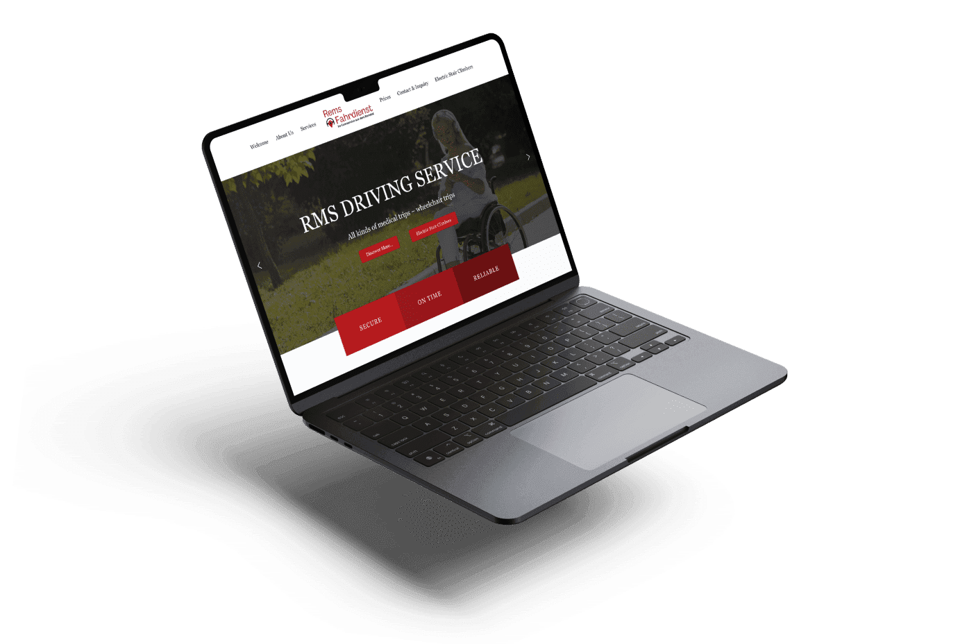
Rems Fahrdienst is a German Taxi company. They provide multi-purpose transportation services for disabled people, children and senior citizens.
We aimed to build a user-friendly website that not only highlights their transportation services but is also easy to navigate for people with disabilities.

Challenges
- To make sure the website is fully accessible to users with disabilities, including those with visual impairments and mobility challenges.
- Highlighting the diverse and customized services for disabled people, children and senior citizens.
- Designing an easy navigation that allows all users, regardless of their technical proficiency, to easily access the information and book services.
- To build a trustworthy online presence that assures users of the safety and reliability of the services.

Solution
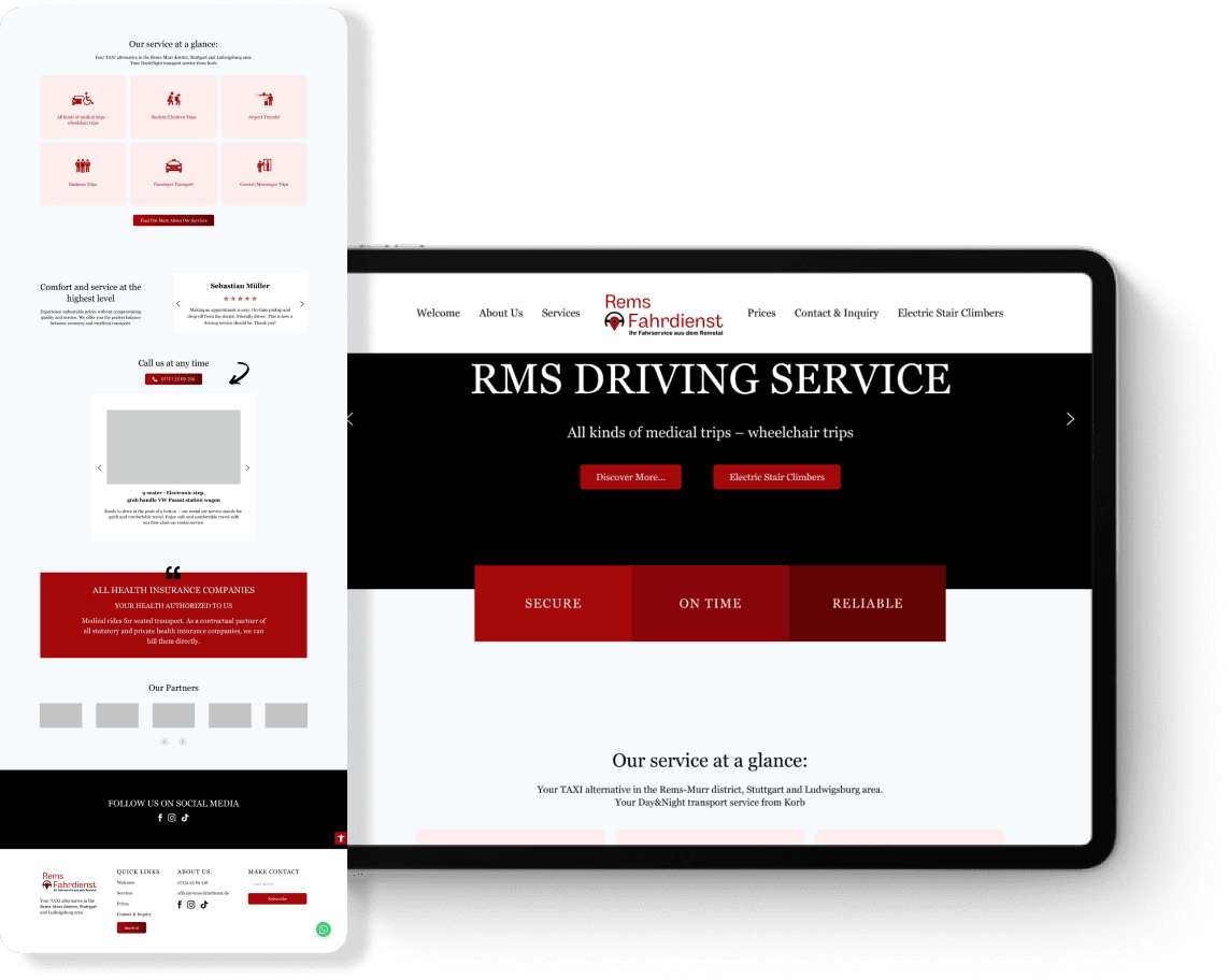
- We used a high-contrast color scheme, primarily black and red, to improve visibility for users with visual impairments.
- Added descriptive Alt text to all images to assist screen readers.
- This accessible design ensured that all users, including those with disabilities, could navigate and use the website easily, which resulted in higher satisfaction and engagement.
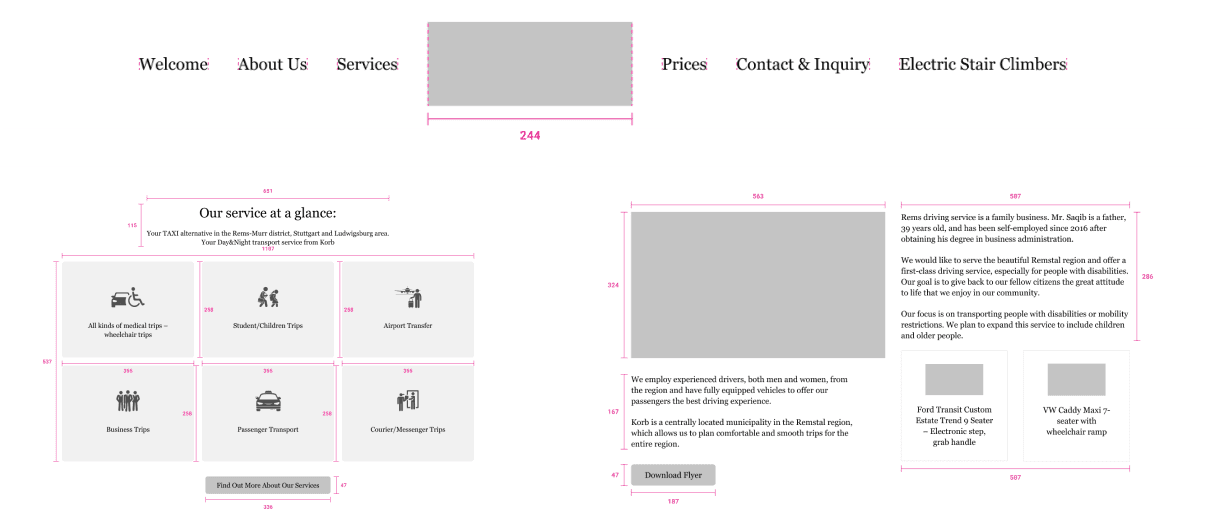
- We designed a clear and simple menu with key sections like Services, About Us, Contact, and Booking very prominent in the front. This easy navigation, paired with user-friendly features, ensured visitors could quickly find information and book services, leading to increased conversion rates.
- We prominently displayed specific services for disabled individuals, children, and seniors on the homepage, along with quick links to detailed information and booking options.
- We made sure that contact information was easily accessible from every page, allowing users to quickly reach out for inquiries and support.
- We designed a hassle-free booking form with clear instructions, large input fields, and user-friendly date and time pickers.
- Additionally, we used large, legible fonts and good line spacing to enhance readability, particularly for senior users and those with visual impairments.
- Each service is described with detailed descriptions focusing on the specific benefits and safety measures customized for disabled individuals, children, and seniors.

Results
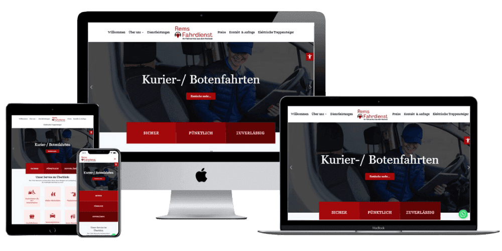
The website features a sleek design, clear navigation, and interactive elements, ensuring inclusivity and ease of use. Testimonials, strategic CTAs, and engaging visuals build trust and credibility, while the intuitive structure allows users of all technical proficiencies to access information and book services effortlessly, enhancing the company’s online presence and reliability.

![Stellr thumbnail [ui/ux]](https://digillex.com/wp-content/uploads/2026/01/Stellr-thumbnail-uiux.png)

