


The Hidden Tricks Undermining User Trust
With the increasing digital transparency, users expect brands to play fair. But not all websites and apps are designed with good intentions.
Welcome to the murky world of Dark UX Patterns, design tactics used to manipulate users into actions they didn’t intend to take. This isn’t just about bad design. It’s about trust, ethics, and the future of digital experience.
Why Dark UX Matters
With rising consumer awareness and regulatory scrutiny, design deception is no longer a risk-free tactic. Brands using dark patterns may see short-term gains, but it comes at a cost – customer churn, reputational damage, and even legal trouble.

71% of consumers say that trusting a brand is more important today than ever before.
2023 Edelman Trust Barometer
What Are Dark UX Patterns?
Dark UX patterns are design decisions that intentionally confuse, mislead, or pressure users into choices they wouldn’t willingly make. The term was coined by Harry Brignull in 2010, and since then, it’s been a growing concern in digital ethics.
Unlike persuasive UX where nudges align with user benefit, dark patterns prioritize conversions at the user’s expense.
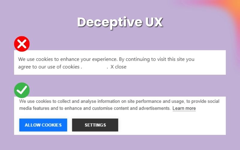
Use Case: Cookie Consent Banner
❌ Dark UX:
- Bright “Accept All” button, dim “Manage Settings.”
- No clear link to what data is being collected.
- Multiple clicks to disable tracking.
✅ Ethical UX:
- Equal design for “Accept All” and “Customize Settings.”
- Simple, one-click ability to reject non-essential cookies.
- Transparent policy link and explanations.

Categories of Dark UX Patterns (With Real Examples)
Bait and Switch
Definition: The interface suggests one outcome, but delivers another.
Example: Microsoft’s old “X” to close the Windows 10 update actually initiated installation
Hidden Costs
Definition: Unexpected fees added late in the checkout process.
Example: Budget airlines showing cheap tickets, then adding baggage fees at the final step.
Forced Continuity
Definition: Trials end, charges begin without clear reminders.
Example: Many fitness apps don’t notify users before charging after a free trial.
Confirmshaming
Definition: Guilt-tripping users into actions.
Example: “No thanks, I like wasting money” as the opt-out text.
Roach Motel
Definition: Easy to sign up, nearly impossible to cancel.
Example: Newspapers or SaaS tools that require phone calls to cancel.
Sneak into Basket
Definition: Extra items added to your cart without consent.
Example: Pre-selected warranty add-ons in eCommerce.
Misdirection
Definition: Interface focuses attention on one outcome, hiding the rest.
Example: Bright “Accept All” cookies button vs. dim “Manage Settings” link.
Disguised Ads
Definition: Ads made to look like native content.
Example: Sponsored posts styled identically to blog articles.
Psychological Tactics Behind Dark Patterns
Dark UX is built on cognitive manipulation. Common techniques include:
- Loss Aversion: Fear of missing out drives rushed decisions
- Friction Avoidance: Users choose the easiest option, even if it’s not in their best interest
- Anchoring Bias: Initial offers influence all further perceptions
- Social Proof Pressure: Displaying fake or inflated popularity (“9 people just bought this”)
A study published in the Proceedings of the ACM on Human-Computer Interaction (2021) analyzed 11,000 e-commerce websites and found that 11.1% used at least one type of dark pattern that exploited known cognitive biases. Source

Tools and Frameworks to Detect or Avoid Dark UX
Practical tools to spot dark patterns:
- UX Check (Chrome extension): Evaluates heuristic violations
- DarkPatterns.org: Community-curated pattern library
- Deceptive Design Hall of Shame: Real examples for analysis
- Cookiebot: Audit cookie consent banners for compliance
Frameworks like Ethical Design Scorecards help assess interface transparency, friction, and reversibility.
How to Design with Ethics Without Sacrificing Conversions
You can be persuasive without being deceptive:
- Use clear microcopy and ethical content types: Inform, don’t mislead
- Offer real choices: Equal visibility to opt-in and opt-out
- Design for reversibility: Easy undo/cancel flows
- Respect default settings: No auto-opt-ins or surprise add-ons
- Show pricing transparently: No checkout shocks
Often, the flexibility of a custom website gives brands full control over ethical UX, helping avoid pre-built patterns that prioritize short-term conversions over trust.
The Business Case Against Dark UX
While dark UX might spike conversions temporarily, it backfires:
- High refund and chargeback rates
- Poor reviews (Trustpilot, G2, App Store)
- Increased customer support costs
49% of users abandon purchases due to hidden fees or manipulative checkout tactics.
Final Thoughts
Design should serve the user, not deceive them. Dark UX patterns might deliver clicks, but they destroy trust – the most valuable asset in digital business. As legislation catches up, ethical UX will not just be a trend. It will be the standard.
Start now. Audit your flows, rewrite your copy, and put your users first.
Because in the end, trust isn’t just a feeling – it’s your brand’s bottom line.
Build User Trust With Ethical Website Design
FAQs
What are dark UX patterns?
Dark UX patterns are design tactics used to manipulate or mislead users into making choices they would not otherwise make. These patterns prioritize short-term business gains like higher conversions at the expense of transparency and user trust.
Are dark patterns illegal?
In many regions, certain types of dark patterns are now illegal or regulated. For example, the European Union’s GDPR mandates clear consent for data collection, restricting manipulative cookie banners. In the U.S., the Federal Trade Commission (FTC) has begun cracking down on deceptive practices under consumer protection laws. However, not all dark patterns are explicitly illegal yet this varies by jurisdiction.
Are dark patterns unethical?
Yes, dark patterns are considered unethical. They exploit cognitive biases and confuse users for profit, undermining trust and respect between brands and consumers.
What are dark pattern tactics?
Dark pattern tactics include a range of manipulative techniques:
Bait and switch — showing one outcome, delivering another
Hidden costs — adding fees at the last step
Forced continuity — auto-renewals without clear notice
Confirmshaming — guilt-tripping opt-outs
Roach motel — easy sign-up, hard cancellation
Sneak into the basket — pre-adding products to the cart
Misdirection — hiding alternatives through design
Disguised ads — making ads look like organic content
Does Google use dark patterns?
Google has faced criticism for certain practices, such as unclear data collection choices or complex privacy settings, but it operates under close regulatory scrutiny. While not all its designs are classified as “dark patterns,” some critics argue that elements such as default opt-ins and complex account settings exhibit characteristics of dark patterns.