


Web agency accessibility failures are more common than most realize. However, many fail to meet real-world accessibility standards. This isn’t just about compliance with WCAG (Web Content Accessibility Guidelines). It’s about creating a digital experience that works for everyone, including people with disabilities. Many agencies treat accessibility as an afterthought. Some rely solely on automated testing, while others install accessibility overlays that create more problems. This leads to lawsuits, poor user experience, and lost business opportunities. This blog explores the common mistakes web agencies make and how to fix them.
1. Common Accessibility Failures in Web Agencies
1.1 Overlooking Alternative Text for Images
One prevalent issue is the absence of descriptive alternative text (alt text) for images. Screen readers rely on alt text to convey the content of images to visually impaired users. Without it, these users miss out on essential information.
Example: A study by WebAIM found that missing alt text was among the most common accessibility errors on websites.
Solution: Ensure that all informative images have descriptive alt text. Decorative images can have empty alt attributes (alt=””) to be ignored by screen readers.

1.2 Insufficient Color Contrast
Low contrast between text and background colors can make content unreadable for users with visual impairments, including color blindness.
Example: The WebAIM Million report highlighted that low-contrast text was the most common accessibility issue, affecting over 86% of home pages analyzed.
Accessibility Audits
Solution: Use tools like the WebAIM Contrast Checker to ensure text meets the recommended contrast ratios as specified by the Web Content Accessibility Guidelines (WCAG).

1.3 Missing Form Labels
Forms without properly associated labels can be challenging for screen reader users to navigate, leading to confusion and errors.
Example: A 2020 WebAIM study of one million websites found that missing form labels was one of the most common accessibility issues. Proper labels help users, especially those relying on screen readers, understand the purpose of input fields. Without them, navigating forms becomes difficult, leading to confusion and errors.
Forms without labels create significant barriers for users with visual impairments or cognitive disabilities. Screen readers may fail to communicate what each field requires, making tasks like online registrations, purchases, or contact forms inaccessible.
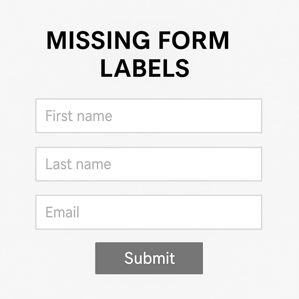
Solution: Eevery form input must have a clear, descriptive, and programmatically associated label.
2. How to Make Accessibility: A Core Part of Web Development
2.1 Train Designers & Developers in Accessibility
Most designers and developers do not receive formal accessibility training. They unknowingly create barriers.
Solution:
- Train teams on WCAG and ARIA best practices.
- Incorporate accessibility checks at every stage of development.
- Encourage developers to use screen readers and keyboard navigation during testing.
Accessibility should be integrated alongside other essential website features during planning and development, not bolted on later.
2.2 Conduct Manual Testing with Assistive Technologies
Automated tools alone are not enough. Agencies must test websites using real assistive technologies.
Essential Tools for Testing:
- Screen Readers: NVDA (free), JAWS, VoiceOver (Mac).
- Keyboard Navigation: Ensure full site functionality without a mouse.
- Color Contrast Checkers: Test for WCAG compliance.
Best Practice:
Simulate disabilities when testing. Navigate a site using only a keyboard. Turn off images and rely on alt text.
2.3 Make Accessibility an Ongoing Process
Accessibility is not a one-time fix. Agencies must perform continuous audits.
Recommended Accessibility Audit Frequency:
| Task | Frequency |
|---|---|
| Manual WCAG Compliance Review | Quarterly |
| Automated Testing | Monthly |
| Real User Testing | Annually |
| Content Accessibility Review | Every Update |
Best Practice:
Assign an Accessibility Lead within the agency. Their role is to ensure every project meets accessibility standards.
Conclusion: The Business Case for Accessibility
Ignoring accessibility costs businesses revenue, legal fees, and customer trust. Agencies that prioritize accessibility win in the long run by:
- Avoiding legal risks (ADA, GDPR, WCAG lawsuits).
- Improving SEO (Google rewards accessible websites).
- Enhancing user experience for all visitors.
- Increasing brand reputation and trust.
Final Thought: Accessibility is not a feature – it’s a fundamental part of web development. Agencies that invest in accessibility, understand why a business needs a custom website, will stay ahead of the curve in both user experience and compliance, leading the industry while others fall behind.
Key Takeaways & Next Steps
✔ Accessibility is not a one-time fix – it requires ongoing monitoring.
✔ Automated testing is not enough – manual checks are essential.
✔ Accessibility training should be mandatory for design and development teams.
✔ Web development agencies like us should perform real-user testing to identify usability barriers.
Build Accessible Websites That Work
FAQs
How many websites are not accessible?
A WebAIM analysis of one million homepages in 2023 found that over 96.3% had detectable WCAG 2.1 failures. The most common issues included low contrast text, missing alt text, and empty form labels. This shows that the vast majority of websites are still falling short of accessibility best practices.
What are some websites with bad UI?
Websites with cluttered layouts, non-responsive design, poor color contrast, or confusing navigation often offer a poor user experience. While specific names change over time, any site that fails to support keyboard navigation, screen readers, or mobile responsiveness can be considered to have a bad UI, especially from an accessibility perspective.
What is an example of poor accessibility?
A registration form without labeled input fields is a common example. Visually, it may look fine, but for screen reader users, it’s unusable. Without programmatically associated labels, assistive technologies can’t interpret what each field is for, making the form inaccessible to anyone with visual impairments or cognitive challenges.
What is a real life example of accessibility?
A well-structured eCommerce website with a strong brand identity that supports keyboard navigation, includes descriptive alt text for product images, and meets WCAG color contrast standards is a real-world example. For instance, screen reader users can browse, add products to the cart, and complete a purchase, all without visual input, because the site was built with accessibility in mind.