When we talk about brand identity, logos are the first element we think of. Logos help customers to recognize and connect with the brand. So, if you’re a designer or studying logos to create one for your own brand, you’ll be able to understand each type well by the end of this article.
Types Of Logos
1- Monograms OR Lettermarks
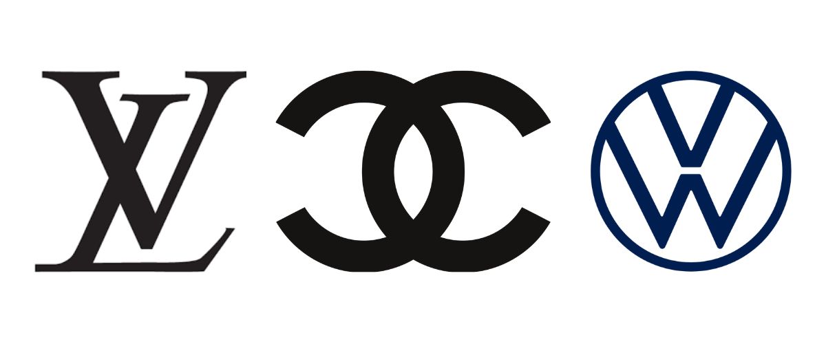
A monogram is a specific type of logo design that uses the initials of a brand, person, or organization to create a distinctive and recognizable symbol. For example, Louis Vuitton’s “LV”, Channel’s overlapping symbol “CC”, Volkswagen’s “VW”, etc. While designing a monogram, it’s important to keep in mind the importance of typography to make sure that the whole design reflects the brand and what it is about.
Pros of Monogram Logos
- When well-designed, lettermarks are easily recognizable, enhancing brand recall among consumers
- They are minimal, versatile, and effective across various marketing materials, from business cards to billboards
- It condenses the brand essence into a compact symbol
- Well-executed monograms often have a timeless quality, ensuring longevity and relevance to the brand over time
Cons of Monogram Logos
- They may lack the descriptive element present in other types of logos like wordmark, which conveys more about the brand or product
- Designing the monograms may be a little tricky as it requires skill to main a readable and unique symbol
- For newer or lesser-known brands, the initial recognition may be a challenge, as consumers need time to associate the monogram with the brand
- Monograms rely on the brand’s initials, so it might restrict flexibility if the brand wants to rebrand or expand its products beyond the initials
2- Wordmarks
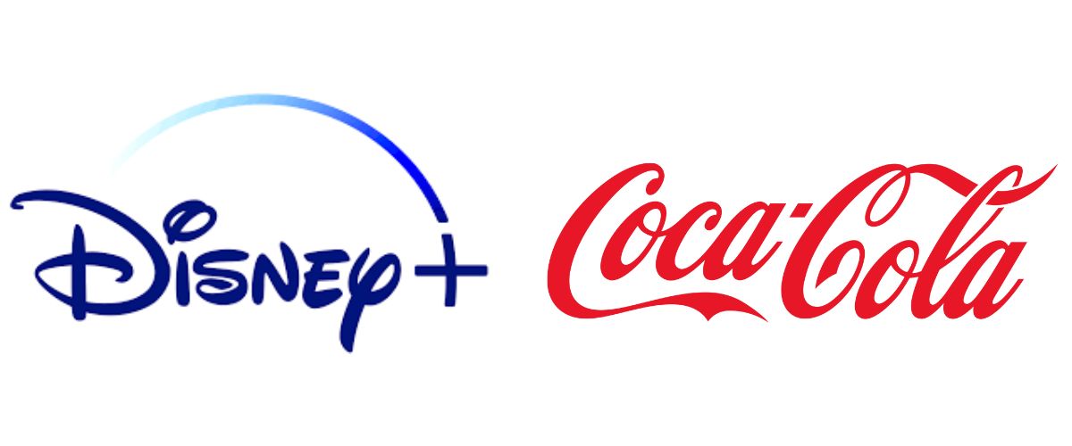
Wordmarks, also known as logotypes, consist of a company’s name. Just like monograms, typography is an important factor here. Coca-Cola’s cursive script logo is the best example of a wordmark. The typography and the red color make it instantly recognizable and leave a lasting impression. Similarly, Disney’s playful wordmark logo reflects the brand’s magical elements. Google is also one of the prime examples.
Pros of Wordmark Logos
- Wordmarks consist solely of the brand’s name, enhancing recognition and association of the brand with the typography
- Helps to establish a strong brand identity, especially for new brands
- Well-designed wordmarks offer clear readability, making the brand name more prominent and easily understandable
- Versatile and offers consistency in branding
Cons of Wordmark Logos
- Wordmarks heavily rely on text, so it might limit the creativity
- Unlike pictorials or abstract symbols, wordmarks might lack visual elements that convey deeper meaning
- For global brands, certain fonts or wordmarks might not translate well or resonate culturally in different regions or languages
- There might be a high chance of similarity with competitors who use a similar font
3- Pictorial Marks
Pictorial marks, also known as logo symbols or brand symbols, use a visual representation or an image to symbolize a brand without incorporating text. A pictorial mark is an image that comes first in your mind when you hear the word “Logo”. One of the main considerations while designing a pictorial mark is the type of graphics or image you want to use in order to give a deeper meaning to your logo.
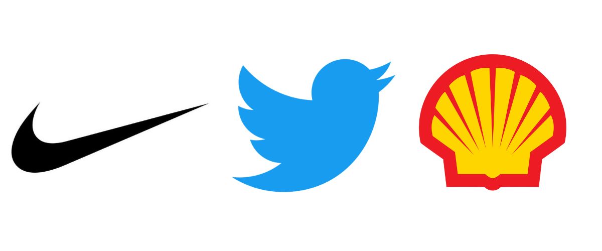
Nike’s iconic swoosh is an example of a pictorial mark, representing speed, movement, and excellence. Similarly, the bird silhouette in Twitter’s former logo represents freedom, communication, and tweeting. Shell’s unique shell-shaped logo is also a cool example of pictorial marks, representing the company’s heritage.
Pros of Pictorial Marks
- Pictorial marks create a strong visual impact due to their easily identifiable symbols
- Great pictorial marks can transcend language barriers, making them recognizable across multiple regions and languages
- They offer a simplified representation of the brand’s identity
- Successful pictorial marks are timeless and remain relevant for years
Cons of Pictorial Marks
- For less-established brands, building recognition with a standalone symbol might be challenging initially
- Pictorial marks can lack descriptive information about the brand or its offerings
- While creating pictorial marks, you need to be quite skillful because some designs can lose clarity at smaller sizes
4- Abstract Logo Marks
Abstract logo marks or abstract symbols use non-representational shapes or graphics to symbolize a brand. These logos don’t directly depict recognizable objects; instead, they rely on artistic or conceptual geometric designs to represent a brand. For example, Pepsi features a multicolored circular logo known as “Pepsi Globe”. It’s an abstract representation conveying the brand’s dynamic and forward-thinking approach. Another similar example is Airbnb’s logo, “Bélo”, representing both a heart and a location pin.
Pros of Abstract Logo Marks
- Abstract logo marks offer uniqueness, allowing a wide range of interpretations
- Well-designed abstract logos are memorable, having lasting impressions due to their distinctiveness and creative design elements
- They are less likely to get outdated or tied to specific trends or eras
Cons of Abstract Logo Marks
- Abstract logo marks lack immediate clarity in conveying the brand’s message. They might require more effort to understand their relevance
- Interpretation of abstract logos may vary among the audiences. While this allows for creativity, it can also lead to diverse perceptions that may not align with the intended message
- It may require significant marketing efforts to associate the symbol with the brand
5- Mascots
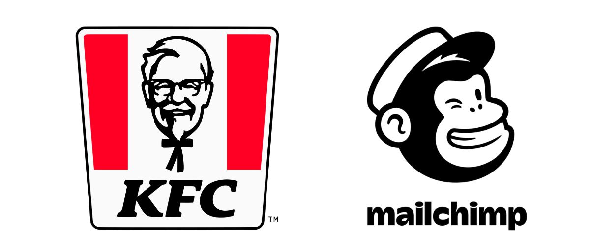
Mascots feature illustrated characters, creatures, or figures that represent a brand or a company. These characters often possess human or animal traits and serve as a personification of the brand’s values, identity, or target audience. For example, KFC’s mascot is Colonel Sanders, an illustrated figure representing the brand’s founder. The friendly and elderly man symbolizes tradition, quality, and heritage. Similarly, MailChimp’s mascot, Freddie, is a friendly and approachable monkey.
Pros of Mascots
- Mascot logos humanize the brand, adding personality and character traits that resonate with the target audience. They evoke emotions and build stronger connections
- Mascots are memorable and engage the audience effectively. They stick in people’s minds.
- Mascots offer storytelling opportunities, allowing brands to create narratives and use the character across various marketing campaigns, merchandise, and brand interactions
Cons of Mascots
- Overreliance on mascots might overshadow other brand elements, potentially limiting the brand’s representation or creating dependency on a single character
- If mascots are not designed carefully, they might show ideas that could make certain groups of people feel left out or add to some stereotypes, affecting the brand’s inclusivity
- As brands evolve, mascots may face challenges in adapting to brand strategies or appealing to new demographics without redesign or adjustments
6- The Emblem
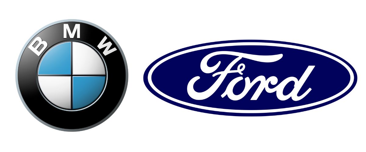
Emblems are the logos where the name of the brand is mixed up in a picture or a symbol, all wrapped up together in a design. It’s like when you see a brand’s name inside a shape or a fancy picture. They are more like stamps and make you think about the history, power, and how long a brand has been around. Starbucks is one of the biggest examples of emblems, featuring a twin-tailed siren enclosed within a circular border with the brand’s name around it. It represents the company’s history, quality, and global presence.
Another example here is BMW’s logo, consisting of the company name encased in a circular structure with blue and white quadrants representing a spinning propeller.
Pros of Emblems
- Emblems often convey a sense of history and authority, establishing a strong connection with the brand’s heritage
- They build recognition and trust among the consumers by providing a cohesive and unique identity that is easily associated with the brand
- Emblems project a sense of professionalism, stability, and authenticity, which can enhance a brand’s credibility and longevity
Cons of Emblems
- The unique design of emblems with detailed graphics and enclosed structure can challenge the clarity
- Offer less flexibility as compared to other logos as they are often more complex and might not adapt well to different applications or resizing
- Updating or modernizing the emblems might be challenging
7- Combination Marks
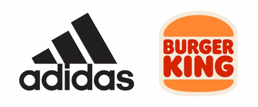
Combination marks are logos that combine a wordmark or lettermark with a symbol, icon or emblem. They integrate both text and visual elements to create a comprehensive and versatile logo. For example, Adidas uses its brand name alongside its iconic three-stripes symbol. Another example is Burger King which uses bold letters in between a well-designed burger illustration.
Pros of Combination Marks
- Combination marks are versatile, allowing text and symbol to be used together or separately across various marketing platforms
- The combination of text and visual elements creates a strong and memorable logo that enhances brand recognition and recall
- These logos can scale effectively. The text and symbol can be adjusted in size without losing the overall impact or clarity
Cons of Combination Marks
- Combining both visuals and text can make the logo more complicated
- If either the text or logo isn’t strong enough on its own, the effectiveness of the entire logo might be compromised
Which One Is The Best?
If you want my opinion, I like combination marks the best because they are beneficial for newer brands, offering both unique typography and symbols.
Whether you choose a wordmark, lettermark, emblem, or combination, each type offers its own advantages and considerations. By understanding different logo types and their strengths, you can make an informed decision that aligns with your brand’s values, personality, and target audience.
Remember, a well-designed logo can be a key to standing out in a competitive market and leaving a long-lasting impression on your customers.

![ClickFunnels VS WordPress – Detailed Review [2024]](https://digillex.com/wp-content/uploads/2023/12/ClickFunnels-VS-WordPress-Feature-Image-1080x630.jpg)