New Look for Prime Vapes Wholesale
Highlights: Thoughtfully designed logo for immediate brand recognition, vibrant and energetic theme and circular logo design to represent inclusivity and that the brand is a hub of vaping products.

Project Brief
We were asked to update and improve the brand identity of Prime Vapes Wholesale. This involves making sure that the brand looks fresh, modern, and consistent in how it presents itself.

Challenges
First, there was a lack of consistency, which weakened the brand’s overall presence and recognition. Some of the visual elements were outdated and did not capture the vaping industry’s modern vibe. It needed to stand out in the competitive market. Additionally, the brand was not able to connect with the retailers and consumers effectively, which is quite important for engagement and trust.


Solution
Here’s how we tackled all the issues.
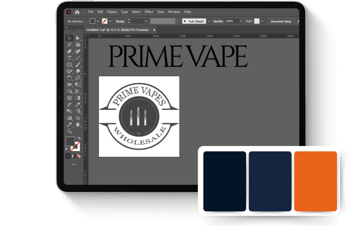
- Redesigning: To enhance the clarity, the existing logo is refined to make it more scalable and versatile.
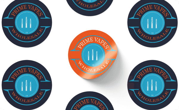
- Recognition: To make it instantly clear that Prime Vapes Wholesale specializes in vaping products, the logo displays 3 vaping devices in the middle. This logo is thoughtfully designed for immediate brand recognition and represents the company’s core business. The circular design of the logo represents inclusivity and community, showing that Prime Vapes Wholesale is a central hub for vaping products.
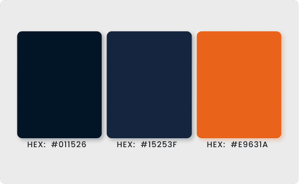
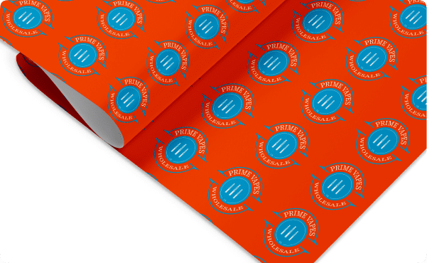
- Colors: The logo maintains the brand’s established colors. It uses a bright cyan background and the text is highlighted in vivid orange to add vibrance and energy.
- Typeface: A serif font is used for the “Prime Vapes Wholesale” text. It represents tradition and reliability.

Results
After refining the brand elements and applying them consistently, Prime Vapes Wholesale strengthened its market presence and built a stronger connection with its target audience. The currently improved brand identity is visually perfect and laid the foundation for growth and customer trust.
