A Little Introduction
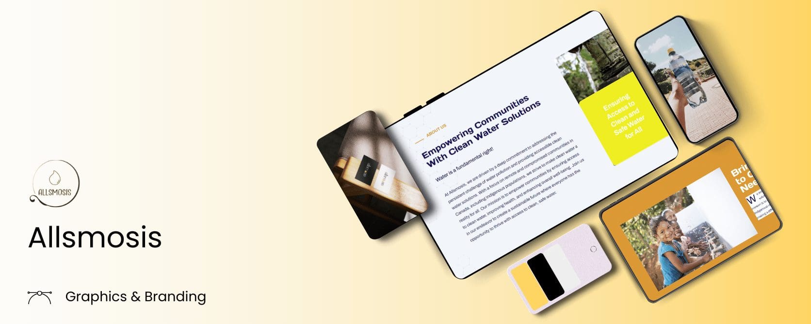
A client approached us with the need to revamp their brand identity. Allsmosis, the brand, aims to bring pure, clean water to communities in need in Canada. We studied the client’s requirements multiple times to make sure we understood their vision.
They wanted a fresh look while keeping the existing color palette. The other crucial thing was to maintain consistency so their audience could easily recognize it. Other than that, the client didn’t have any significant demands.
Project Goals
We needed to build a strong and modern brand identity that emphasizes Allsmosis’s innovative methods and dedication to top-quality water purification technology. Here’s how we managed the project amidst all the workload.
The Rebranding Process
- First, we carefully analyzed the existing logo to understand its strengths and areas for improvement. We wanted to retain elements that were already working well while modernizing and enhancing the overall design. Have a look at it here:

- We reviewed the client’s requirements multiple times to make sure we fully understood their vision and expectations. We then brainstormed to generate ideas that would best meet their needs.

- With a clear understanding of the client’s goals, we began designing the new logo. We selected a color palette that would represent the brand’s mission of purity and cleanliness effectively.

- To ensure consistency across all brand materials, we created a comprehensive brand guide for Allsmosis. This guide included the new logo, color palette, typography, and usage guidelines. It serves as a reference for maintaining brand coherence in all future communications and marketing efforts.


Outro
With a simple and clear logo, modern Playfair Display as a primary typeface and a vibrant color palette, we gave Allsmosis its refreshed brand image. Now it shows the company’s values and technological skills more accurately.


